Posted 16.04.2020
By Luke Pickering
Heatmapping is a technique used in Conversion Rate Optimization (CRO). In this area, we focus on increasing a website’s profitability by making the most of the existing traffic. We do this by analysing the journey your website users take to determine how the User Experience (UX) can be improved.
There are a number of key factors to look at when using heat mapping; where users click, how long they spend on a section of a page and the route they take to convert. So when it comes to CRO, we ultimately aim to make the users’ experience easier and more enjoyable; making subtle adjustments designed to enhance user experience and encourage users to convert. There are a number of heatmapping tools and plugins but we’ll be using the example of HotJar to help you understand what to look for and how you can use this tool to the best of its ability.
There are so many functions that software like HotJar can provide for you, and throughout this blog post we’ll break them down in more detail. However, before we do, we want to point out some other software that you can use instead; for example, Crazyegg and Mouseflow. Google even offers a free chrome extension called Page Analytics which allows you to analyse the users’ clicks however it can’t provide the functionalities of more premium services. Some of the heatmaps to look at include:
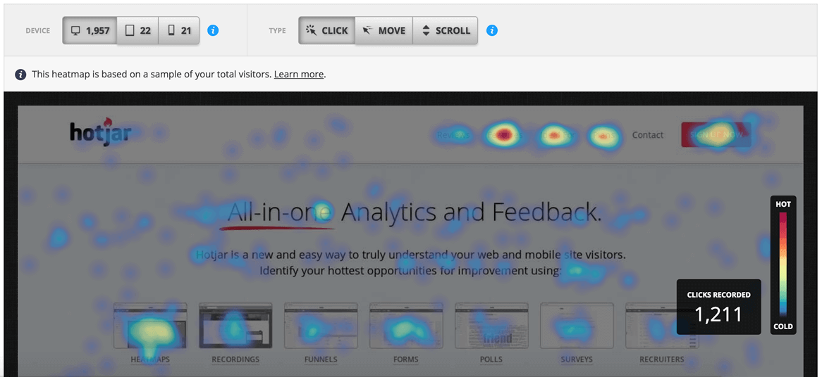
This is probably the most simple and the most helpful type of heatmap. It enables you to track where users have clicked on the important sections of your site. This can be really useful for showing which on-page elements are attracting the most clicks and allows you to make design decisions such as the order of items in a navigation bar and the placement of CTAs.
When you combine this type of a heatmap with conversion path analysis you can figure out the steps that users are commonly taking from the landing page to the point of conversion. This lets you see where users are dropping off and which paths enable users to convert the easiest.
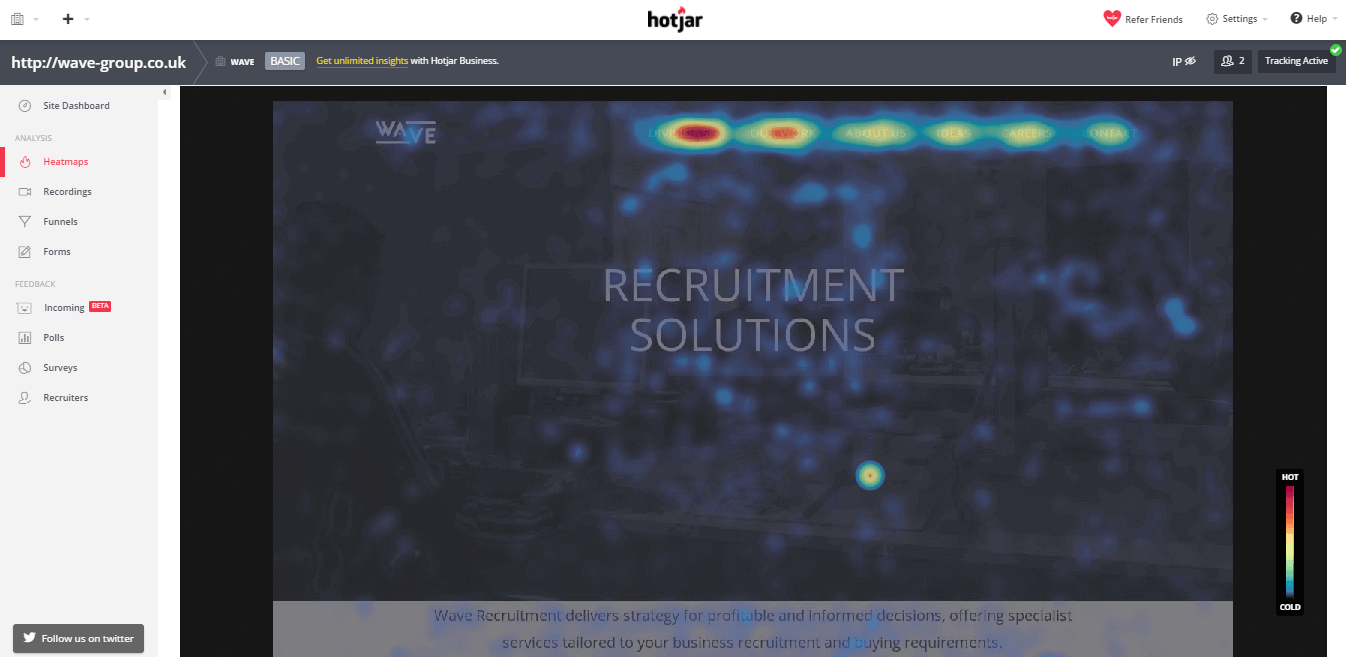
This type of heatmap allows you to see where users have moved or hovered their cursors on your site. It’s very similar to a click heatmap however it lets you to pinpoint elements on your site that have briefly attracted users’ attention but didn’t quite do enough to be clicked on.
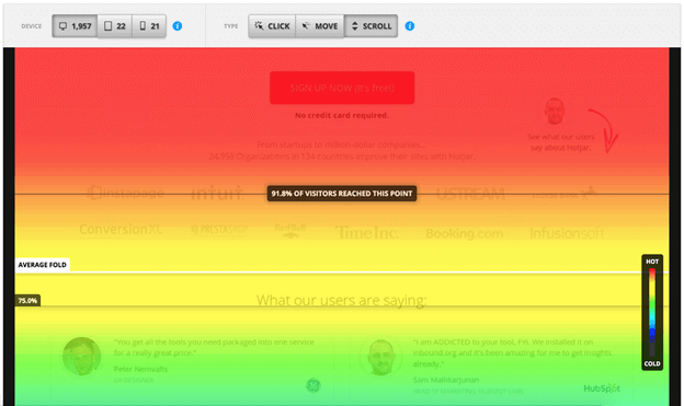
The final important heatmap tool is the tracking of how far a user scrolls down the page on your site. This tool is especially useful if your website puts up a lot of heavy content. If you can understand how far down a user gets on each page before leaving, you’re able to understand their path and then effectively optimise your content to optimise their journey. If you combine a scroll map with Google Analytics metrics (bounce rate and average time on page) you can work out if the content is doing the job and actually appealing to the users who visit your site.
Once you have gathered all of your data and now understand how users interact with pages and your whole site it’s time to start implementing changes to help optimise your Conversion Rate. Usually, this is done through making alterations on your site to things called elements. These elements can be anything from a button with a CTA, a signup form or social media buttons.
If your drive is to get people to sign up for your newsletter it’s so important to ask the question of “How Accessible Is The Element?”. You want to make sure that the users can find what they need in a short period of time. Obviously, the higher up the page it is the easier it is for the user – alternatively, just make sure it is big enough and visible enough so that they have no issues finding it.
There are a number of things you can do to make it easier to make an element more obvious. For starters, you could place an element above the fold on your page. This means you’re making the user’s life as easy as possible. They don’t have to do a lot of scrolling. It is there in front of them without having to search the entire page. It can also be done through simply moving around some other parts of the page. Make some layout adjustments to make your users’ life easier if you want them to find certain information then make it clear to them.
Sometimes you will have to add new content or new buttons to improve the experience but sometimes it might just be a case of modifying existing elements. The best way to have the best experience is by imagining it is your first time on the site and how it easy it would be to do the one action you want users to do.
Hopefully, you now understand how you can use heatmaps to improve your User Experience. If you’re looking for more help with Conversion Rate Optimisation on your website, get in touch with us today…
Need help with your web design or digital marketing?
Talk to an expert today or call us on 01332 493766
 Part of The Digital Maze Group