Building Better Website Forms To Drive More Conversions (and Revenue)
Posted 27.01.2025
By Pete Bingham
Too many websites are plagued by poorly designed forms – they’re everywhere!
From confusing layouts and ambiguous fields to unnecessary information requirements – bad forms are frustrating your users, forcing them to abandon your site and head straight to your competitors.
The importance of a well-designed form can’t be overstated, but still, poor form experiences remain incredibly common.
By that logicsssss a poor form will lead to thousands of missed opportunities, hours of wasted time, and a sales funnel that struggles to perform. So what are you going to do about it?
How to Fix a Poorly-Performing Website Form
Put simply, a bad lead generation form is one that fails to achieve its primary purpose: capturing high-quality leads while providing a good user experience.
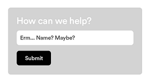
Too short to be useful
Every use case is different, and shorter forms certainly have their place, for example, a newsletter sign-up form might only need a name and an email address. But shorter forms can leave your sales team ill-equipped to qualify, nurture or follow up the enquiry effectively. Without context – like the lead’s role, a company name or URL – you might be presented with a cold list of contacts and no insight into how to approach them.
The Fix:
Whatever information you need to process an enquiry has to be a required field on your form.
If space is limited, consider what is the bare minimum to start processing that enquiry and get the ball rolling. For example, if all enquiries start with a phone call, make sure you’re collecting that information from the kick-off.
Overly complex, intimidating or time-consuming
On the flip side, forms that demand too much information upfront can scare users away or feel like a chore. In fact, 27% of people abandon online forms because of their length. This can cost you leads before they even enter your funnel. But what if you genuinely need detailed information to process a specific type of inquiry, such as lengthy applications or tailored consultations?
The Fix:
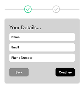
Ideally your form should not take up more space than can fit on a screen. If your form has 10+ fields, you need to consider breaking it up creatively. The key here is user experience. If you can’t shorten the form, consider splitting it into a multi-step format.
Begin by asking the most critical questions at the first step.
Group related fields together and use clear headings to guide users through the form.
Make navigation easy with arrows or pagination and allow users to go back and edit their answers if needed.
Adding a progress bar shows users how far they’ve come and how much is left, giving them a sense of accomplishment as they move through each step.
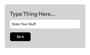
Vagueness or asking the wrong questions
Even if you think your forms are easy to follow, they might not be intuitive for your users. From unclear questions to poorly designed layouts, if your forms confuse users, the information you collect won’t create a cohesive enquiry.
A common example is using a vague field like “message” instead of asking for specific information. This leaves users unsure about what you actually want from them, resulting in irrelevant or incomplete responses.
The Fix:
The best way to ensure clarity is to test your forms. Ask users (or colleagues, friends or family) for feedback on the readability and clarity of each question. Did they understand what was being asked? Were any questions ambiguous? Testing with real users provides valuable insight into how your forms are interpreted, helping you adjust the wording or layout for better responses.
Don’t forget to ask your sales teams what they think is most commonly missing, or vague, when it comes to completed enquiries. Collaborating across teams will help you find the perfect solution.
You can even use tools like Google Analytics or A/B testing to track form abandonment rates and work out where users are dropping out.
Provide clear labels for your fields, and end with a clear, and specific, call to action. Instead of a generic “Submit,” use something specific like “Request a Quote,” or “Book Your Consultation.”
Poorly designed or hard to use
A form that’s visually cluttered, difficult to navigate, or not mobile-friendly creates unnecessary friction and feels at odds with your brand, and potentially even untrustworthy. Slow load times, confusing layouts, or unclear instructions make users more likely to give up.
The Fix:
Make sure your form looks like it belongs on your site – don’t just accept the form plugin’s default styling, but do prioritise clarity and simplicity.
Use the appropriate field style for the information you’re collecting.
Broken forms
One of the most overlooked issues with lead generation forms is that they stop working altogether. Over the years, we’ve worked with hundreds of businesses, and you’d be surprised at how often we find broken forms on their websites – and they all assumed everything was working fine.
Whether the issue is immediately obvious or just a subtle functionality problem, it’s more common than you might think. It could be an outdated plugin, a dodgy CAPTCHA installation, or some other technical glitch, but broken forms can often go unnoticed until you realise you’re missing valuable leads.
Even if the form is technically working perfectly, if the form looks broken, for example with fields that aren’t aligned properly or buttons appearing out of place, users may feel like the site itself is unreliable or untrustworthy. Trust is critical for conversions, and a massive 29% of people are likely to abandon your forms if they don’t trust your site.
The Fix:
If your form is broken, try updating your form plugin first (but please take a backup just in case!) as this can often be the cause.
Ask your team to test your forms for both functionality and appearance once every month if possible. Catch any issues early.
Don’t just test forms on your laptop, use a range of devices if you can.
If your form looks really bad, ask a friendly web designer to help. It could really make a difference to conversions.
What Else Can You Do to Optimise Your Website Forms?
Optimising your website forms goes beyond just fixing issues with functionality and design. To get the most out of your forms, consider these additional improvements:
Ensure Your email plugin is configured effectively
Many businesses overlook how their form submissions are sent once completed. To ensure the data is useful, properly organised and working harder for your team, you could:
Track where the submission came from: Use hidden fields to include information like the page the form was submitted from, or the GCLID (Google Click ID) if it’s the result of a paid ad. This gives you crucial insights into which campaigns or pages are driving leads.
Add tracking info: Implement UTM parameters or tracking codes in your form submissions to track the source of your leads, such as specific campaigns or marketing channels. This data helps measure the ROI of different marketing efforts.
Avoid dropping all the fields into an email: Take the time to title each field clearly so that the information can be processed easily by your sales or support team. This saves time and prevents confusion.
Label your fields clearly
Use asterisks for required fields: Clearly mark any mandatory fields with an asterisk (* required) so users can quickly identify which information they must fill in.
Add placeholder text: Include helpful placeholder text in your fields. This helps guide users on what to enter and reduces confusion. For example, use “e.g. John Smith” in the name field so users know you want their full name.
Match Your Fields to the Type of Input
This one is really simple, but it’s criminally overlooked. Use the most appropriate kind of field for the data you want to collect. For example:
Dropdowns: Avoid dropdown fields when there are only 2 or 3 options, use radio buttons instead.
Text fields: Text fields should be roughly the size of the expected input. If you expect a longer message, use a larger text box. If you just need a name or email address, keep it shorter.
Number fields: If you’re collecting a number input e.g. a phone number, use the type=”number” attribute, or go further still with input type=”tel” pattern=”[0-9]*” inputmode=”numeric”. This will ensure that mobile users are presented with a number keypad for input.
There are many input attributes and patterns you can use. Hopefully your chosen form plugin handles most of this for you, but it’s always worth checking you have the correct one in place.
Input
Purpose
type=”email”
For email addresses. Adds validation for @ and .com.
type=”url”
For website URLs. Adds validation for proper website address formats.
type=”tel”
For phone numbers. Opens the numeric keypage.
type=”password”
For secure, hidden text input.
type=”date”
For dates and times.
type=”time”
For time.
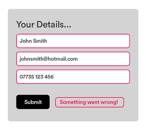
Provide error validation and clear instructions
What happens if the form doesn’t send or there’s an error?
Error validation: Ensure your form includes clear error messages if something is filled out incorrectly. This could be as simple as displaying a message like “Please enter a valid email address.”
Clear instructions: If certain fields need a specific format (like a phone number or date), be sure to provide instructions, so users don’t make mistakes. For example, if you need a date in the format DD/MM/YYYY, let them know!
Use thank you pages or follow-up emails
After someone has submitted a form, make sure to follow up with a thank you page and an email confirming their submission. This not only reassures users that their form has been received but also opens up an opportunity to:
Redirect users: If appropriate, you can direct them to additional resources or content relevant to their enquiry, increasing engagement and time spent on your site.
Set expectations: In your thank you message or email, set clear expectations for what will happen next, like how soon they can expect a follow-up or response.
Optimising Website Forms for Better Results
Ultimately, your lead generation forms are a crucial touchpoint for converting site visitors into potential customers. A well-crafted form that balances user experience and intent is the key to driving more meaningful submissions and nurturing better leads.
Your forms should be intuitive, fast, and frictionless while still collecting the necessary information to qualify your leads.
Remember to test them regularly to prevent broken forms, missed leads, or a frustrating experience for your users.
And finally, continue to optimise. From improving the clarity of your questions to integrating smarter functionality, always look for ways to make your forms work harder for you. A few tweaks can turn your website forms into powerful conversion tools that drive more qualified leads and ultimately, more sales.
Keep in mind those stats from the beginning of this article – 50% of marketers say online forms are their main source of leads anda whopping 70% of users will abandon a form if they are struggling with it. Don’t leave your users frustrated, and keep those leads coming in!


 Part of The Digital Maze Group