Posted 28.03.2019
By Lucy Bradley
As the name would suggest, a landing page is a webpage that users are able to land on. Whether that be through a search engine, ad, or through other marketing campaigns you’re running. Landing pages should be targetted towards a particular audience for a set purpose, and support in campaigns through generating leads or driving sales. The benefit of such a targetted landing page is that you are able to fine-tune each of its elements around your target audience to generate the best results. But what are those elements, and how do you make them successful?
The title of your landing page is key, it’s the first thing that visitors will see when they arrive on your landing page. Users will use the title to assess whether they think the page will meet their need or not. So if it’s not optimised, your users will bounce immediately. We don’t want that!
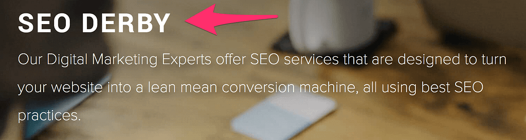
We know that Google uses page titles as a ranking factor, so depending on the purpose of the page, and whether or not it will be indexed, you’ll want to make sure the title is optimised from an SEO perspective. For example, our SEO page which is optimised for search engines has the following title:
However, you also want to make sure that it’s engaging, clear and relevant to the user. You might be able to afford to be a little more creative if you don’t need to go crazy on SEO for the page.
The next really important element to include on your landing page is a strong call to action. You’ve created the landing page because you want the user to take a particular action right? So make sure you make that action as clear as possible to the user so that they are more likely to do the action. Whether it’s making a purchase, getting in contact with your or downloading a resource. If you do your CTAs well, it will help to boost your conversion rates massively.
The next really important aspect of your landing page is the copy you use throughout. This is what will make or break the landing page. There’s no use having a really funky design and CTAs if you don’t have the right content to tell the user what the page is about. When you’re putting your landing page content together think about the tone and person that you’re writing in. Make sure it works in line with your brand guidelines. Are you more formal, or informal? What’s the purpose of the content? To inform, engage, persuade or entertain? That’s for you to decide on before you actually get to writing.
Most importantly, ensure your content gets to the point you want to make as quickly as possible. Provide users with the content that they want, in as few words as possible. Sometimes this is easier said than done, however, there is a way around this. Use good separation throughout your landing page to break up sections. Make use of different colour blocks and placement, it’ll help keep engagement up. Where you can, use bullet points too; as this way of presenting content makes it easy for the user to digest. You want to make sure you’re leaving your website users feeling informed, engaged and ready to take the next step.
When we’re talking about content, we don’t just mean written content. Visual content is really important in engaging the user and keeping them on the page. If you can, look at including a video on your page; including video on a landing page can increase conversion rates by 80%. Videos are both highly engaging and informative, and in the right industry, videos can be the best way to show off what you offer. However, don’t just use video for the sake of it. Only include a video if it will actually provide the user with value.
If a video isn’t right for you, imagery is a must! When people read information, they’re likely to remember only 10% of that information three days later. However, if a relevant image is paired with that same information, people retained 65% of the information three days later [source]. Help your website visitors to resonate with the information so that even if they don’t convert immediately they might do at a later date!
Whatever type of visual content you plan on using, make sure you invest in the quality of them. After all, they’re a representation of what you’re selling! Poor imagery and video quality can actually end up working against you. Why not take a look at how else to utilise visual content in your marketing?
In a similar way, you can use your hero area to display visual content to users. When done correctly, a hero image will instantly engage your user and this can be the difference between them staying on the page to read what you have to offer, and bouncing. It’s important here to think about sizing so that it doesn’t take up too much or too little of the page. Also, ensure that you choose an image or video that supports the rest of the content on the page.
Including trust signals is key for any landing page that aims to get users to convert. Luckily, there is a range of trust signals out there to suit the goal of your page. The most obvious ones are reviews and testimonials, these help to show what others thought of their experience, and can show to users what they can expect from you. However, the use of trust signals goes way beyond on this. Where you can, feature relevant certifications & accreditations, key performance indicators and credible logos (these are key for payment, such as a PayPal or Visa logo). Provide users with that little bit of reassurance that will make them more likely to convert.
Sometimes having just a CTA on a page is not enough. Some users will naturally want to find out more, or get in contact with you. Potentially when a larger financial investment or bespoke service is involved. In this case, make it as easy as possible for users to get in contact with you by providing easy to see contact details. Depending on the goal of the page, you could also include an on-page contact form to make this easier for the user.
Before you get carried away with design, imagery and content… It’s important to remember that technical guidelines should always be followed to ensure you’re making pages in line with Google’s official guidelines, and also providing a good user experience. Some things to consider are:
With all of the above in mind, the final thing to remember is to test! Use Google Analytics to assess your page’s performance and make changes where necessary. If you’re aren’t sure how to set it up, we’ve put a beginners guide to setting up your Google Analytics that you can follow!
Alternatively, if you need some help designing and developing an engaging landing page, our web design experts are here to help! Get in touch to discuss your project requirements, and see how we can start meeting your goals!
Need help with your web design or digital marketing?
Talk to an expert today or call us on 01332 493766
 Part of The Digital Maze Group