Posted 27.02.2024
By Pete Bingham
Getting from A to B on your website should feel natural and intuitive. It should be a breeze, without any detours. Achieving this requires a seamless navigation experience that isn’t just limited to your main menus – your visitors need signposts throughout their visit that guide them in the right direction. Whether it’s easy-to-read copy, well-positioned CTAs, breadcrumbs, or countless other useful signposts, navigation these days needs to be considered from a whole-site perspective.
If your signposts aren’t there, how will people find their way to the information they need?
Okay, let’s go back to basics… The internet is crammed full with information, and it’s not getting any quieter (thanks AI). Attracting visitors to your site is a big challenge, but getting them to stay (and convert) is another thing entirely.
Let’s take a very simplistic look at how site navigation works on your website.
The very beginning of a visitor’s journey might begin with a search engine and, by extension, your site’s metadata. Metadata supplies information to search engines and users about the content and structure of a webpage. Done right you’ll attract more people to your site, just like any good sign (the actual quality of page content will also determine how many people will see the sign, of course).
Let’s say a person likes what they see in your metadata and clicks through to your website. Your main menus are designed to provide the most direct and accessible method for users to navigate your site; listing all your key pages in one place (in most cases they are also served to every visitor on every page via the website’s header and footer).
But in terms of first impressions, your visitors are more likely to be drawn to your page content (category, product, blog, etc) from a search engine. On this basis, your headings, copy and the visual elements on your pages provide your visitors with the most immediate signposting instead. They offer detailed information about the services and products you offer and direct your visitors through the landscape of your content. Remember, it takes about 50 milliseconds for a visitor to decide whether or not to stay on your site.
If you’ve managed to capture your visitor’s attention, your deeper content (e.g.links, products and CTAs) are usually the final signpost for your visitors. This is what results in a coveted conversion.
There are, of course, thousands of other possible touchpoints that visitors may encounter on their journey with you and your brand, from paid ads to social media and everything in between. So let’s go into a little more detail.
As I mentioned earlier, metadata provides information about the content and structure of a webpage to both search engines and users. There’s a whole lot more information on our technical seo page, but from a navigational perspective, keep reading.
Title tags, for example, appear in search engine results (as well as in your browser’s title bar). A well-crafted title tag not only helps with SEO by describing the nature of the page to a search engine, but also serves as a concise description of the page’s content. Thus acting as a signpost for users.
Meta descriptions on the other hand provide a more detailed summary of a page’s content. While they may not directly impact SEO rankings, they can influence click-through rates from search engine results. That’s because a well-written, clear and enticing meta description gives people a preview of what to expect on the page. If they like what they read, they’ll follow the link.
Schema.org markup (a form of metadata) helps search engines better understand the content on a page. And even better for you (and your users) they can end up as rich snippets in search results, providing users with even more information and improving the visibility and signposting of your content.
It’s also worth mentioning breadcrumbs here, as they let visitors see how the website is structured so they can move around it more easily. Breadcrumbs are for following, just like in Hansel and Gretel.

These are all signposts, and they all work to inform and direct people on your site.
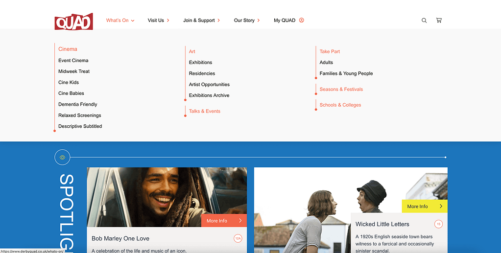
Since the beginning of the modern internet, websites have had menus. They are usually found along the top (the header) and the bottom (the footer) of a site – though occasionally, you’ll find them elsewhere too, such as sidebars, secondaries or sticky menus.
The term “menu” is borrowed from the concept of a restaurant menu: a list of dishes or options available for customers to choose from. So too on a website, your menus should list your site’s key pages so visitors can see what you offer and access it easily. However, there’s very rarely space to list every page on your site so it’s crucial you consider your main navigation menus thoroughly.

From well-known brands to local businesses, we’ve helped hundreds enhance their online presence and guided them toward success.
Like everything in digital marketing, knowing your audience and industry is the key to success; what are your key services or products, what are your popular pages? These fundamental insights will help you determine which top-level pages to stick in your menu.
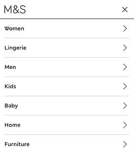
See below how M&S prioritise “women” then “lingerie” before moving onto “mens” and “kids” in their mobile menu? This isn’t random, or a mistake – it’s intentional, as a lot of their audience are probably women and a large percentage of them are looking for lingerie. Their audience data has informed this idea and so they’ve implemented it.
Other important menu items are more informational or support-based, such as delivery, contact or company information pages. It is quite common to see these sorts of menu items in the footer menu, but each business is different.
Simplicity rules when it comes to navigation menus. Give too many options and it will become cluttered and unusable. If your product offering is complex, you might want to consider adding submenus and a search bar to keep things in check.
Consider intent. Are people looking for these pages directly, or is it something that should come later in the user journey? For example: individual products rarely sit in a main menu (unless your offering is limited). It is more common (and makes more sense) to have categories in a menu. If people are looking for something directly they will likely land on that page via Google, or use search functionality on your site.
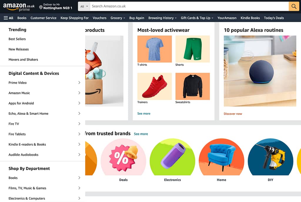
Look at Amazon, they sell everything right? And whilst nobody could ever call their site “simple” or a paragon of good design, they use a variety of navigation bars, side bars, hamburger menus and more/ it’s not perfect but they keep it as simple and intuitive as possible, informed by data, previous purchasing histories and ever increasingly, by implementing AI to dynamically build a more informed, personalised experience.
It probably goes without saying, but a poorly designed menu (aesthetically, functionally or both) will have a serious impact on user experience. There are many factors here of course, but clear labels, good hierarchy, whitespace and a flawless experience on mobile are crucial when it comes to signposting.
Further to the last point, great design definitely influences decision making.
We’ve already touched on the importance of good first impressions, and the value of a visually pleasing and professional-looking website. This will instil trust and confidence, reduce bounce rates and encourage people to explore further.
But great design and visuals also help amplify the message you’re trying to convey. They clearly communicate the purpose of a page, product or service as well as the value it offers, and how to proceed. Clear and concise design elements, such as headlines, images, and calls-to-action, also guide users through the decision-making process.
There are plenty of detailed articles on the importance of good design and UX out there, but the key point is: good design directs your customers clearly and intuitively. Signposts, signposts everywhere.
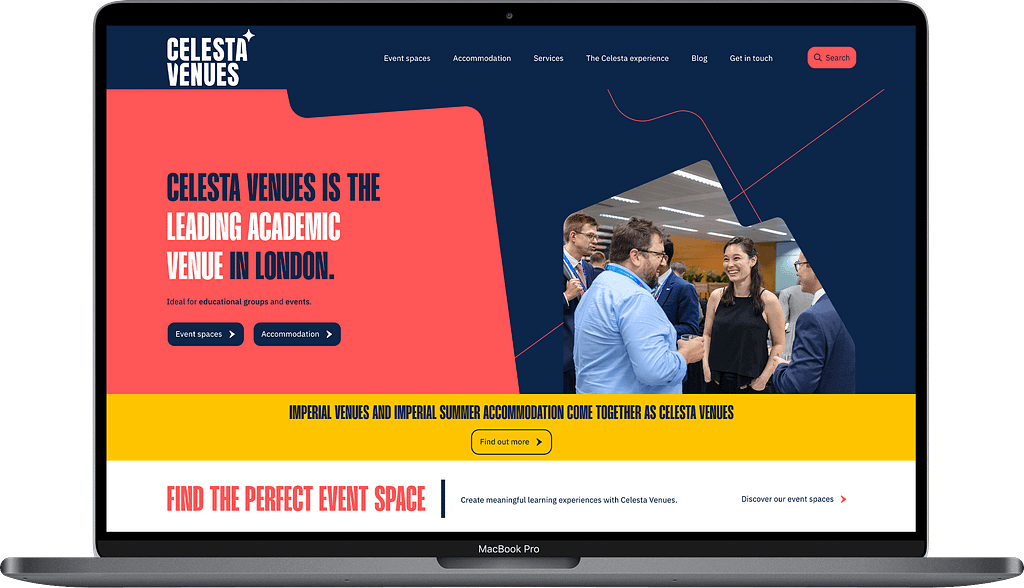
The Celesta Venues website we built for Imperial College really makes full use of colour, branding, real photography (i.e. not stock) to build a compelling easy-to-navigate site, that knows exactly what it’s audience is looking for. It’s a signpost goldmine.
Many websites have plenty of great content, but it’s almost impossible to digest any of it because of the way it is seemingly thrown on a page. Obviously, that’s never the intention, but too often content is an afterthought once a site is already designed, and too rarely the other way around. The content becomes added noise.
A content-first approach is the only logical way to ensure your content is not only abundant but also accessible and impactful. By adopting a content-first approach, you prioritise the heart of your website – the information, messages, and direction you want to convey.
With an existing website, this isn’t possible, but there are plenty of ways to optimise your content for readability, SEO and conversion without having to start from scratch.
From excellent photography to iconography, visual elements inform visitors, add weight to messages and help direct attention. A picture does speak a thousand words and you can describe a product in far greater detail with a few good photos than you can in several paragraphs. (With my SEO hat firmly on I should say that ideally, you should have both).
I spoke more about the importance of good product photography over on the Boom site too.

Understanding how a page’s information hierarchy works is crucial for effective communication. Firstly, you need to prioritise the key messages on your page. Whether it’s a compelling value proposition, a CTA, or critical information, strategically placing these elements on a page ensures they capture the user’s attention immediately.
Establishing a good hierarchy means structuring your page content to mirror how people naturally consume information. From headlines to subheadings and short, easy-to-digest body copy, a thoughtful hierarchy guides users through a logical flow, preventing them from feeling overwhelmed and directing them naturally.
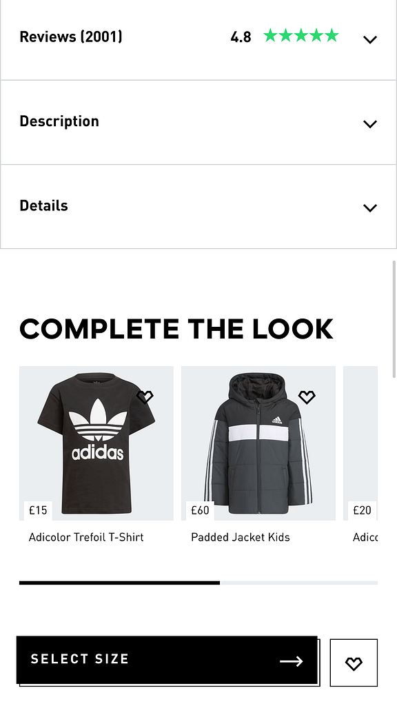
A typical page won’t have one single CTA. Instead, it should be strategically peppered with carefully crafted CTAs that guide users towards goals appropriate for their intent. With that in mind, a page’s CTAs shouldn’t all have the same “weight”.
Consider a product page; your most prominent CTA is going to be “buy now”, right? But plenty of people won’t be ready to buy until they’ve seen other information such as specifications, delivery information, buying guides and so on. So these all need to be clear, without overwhelming the user.
Whatever the CTA is, the message needs to be descriptive and the end goal clear. Don’t just rely on “find out more” etc, add more detail and connect with your audience’s intent.
Whether you’re at the start of a web design project or looking to optimise your content for conversions, the key is keeping your visitors happy, informed and engaged.
Okay, so I used the phrase content-first earlier on, and I stand by that. But now that mobile traffic makes up 50% of internet traffic and is growing each year, your content has to be, first and foremost, consumable via your phone.
Hamburger menus are the standard for your main navigation menu, but implementing one often requires a bit more finesse than just using the same pages as your main desktop site. Why? Because people consume information and navigate websites differently on mobile devices – prioritising access to that content on mobile is key.
An example is where you have over a dozen categories on a site. That is going to occupy a lot of screen real estate on a mobile. Cutting them out entirely is probably not a sensible option but prioritising your bestsellers and reordering them accordingly is.
Similarly, adding a more minimalist structure on mobile makes sense from a design perspective, but ensures the route to subpages is intuitive.
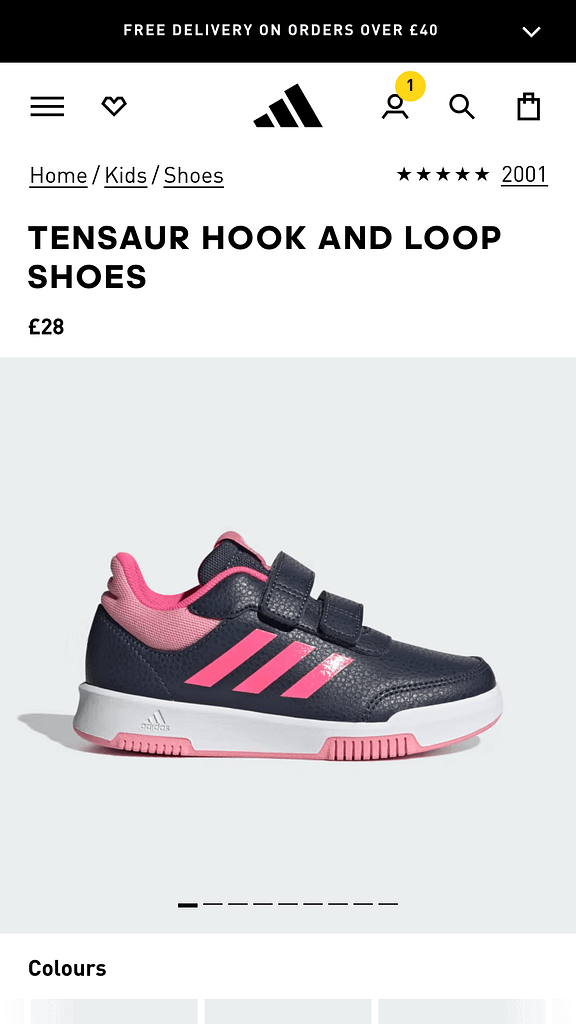
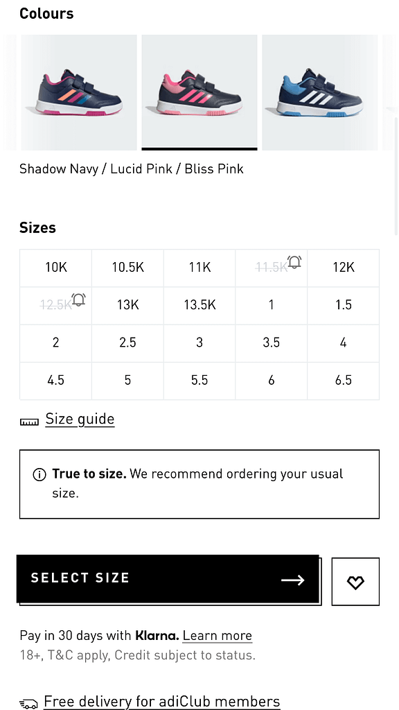
This one is trickier because you will likely be serving the same content across multiple devices, but the way users interact with that content can vary. A good mobile experience delivers a seamless and enjoyable experience for users exploring your website on smaller screens, which might mean making use of mobile design stalwarts like carousels, tabs swiping and gestures to serve up that content in an mobile-optimised form.
The Adidas site (see above) implements nearly all of these and more throughout, showcasing an extremely slick user experience on mobile.
Whether you’re at the start of a web design project or looking to optimise your content for conversions, the key to conversion is user experience – keeping your visitors happy, informed and engaged. When the experience becomes frustrating, users switch off and move away.
Providing a natural and logical pathway, full of signposts keeps people moving in the right direction and one that hopefully ends in a sale.
Need help with your web design or digital marketing?
Talk to an expert today or call us on 01332 493766
 Part of The Digital Maze Group