Posted 27.03.2024
By Pete Bingham
Web design trends come and go and while it’s important to maximise engagement with a website that speaks to your audience, the true essence of a great website lies in its ability to endure both technologically and aesthetically, not jump on a new trend every few years.
How often you update your website design depends entirely on your business, however chasing design fads can result in businesses overlooking, or turning a blind eye to crucial aspects of their website’s functionality and user experience.
Let’s go back to basics and turn our attention to five common pitfalls that can hinder your website’s performance, with tips on how to resolve them, as well as a few tools and resources that can also help.
Large images, excessive plugins, and inefficient coding can slow down your website. And whilst not neccessarily a “mistake” – too many website and content admins overlook key factors that are essential in keeping page speed nice and zippy.
So, while optimising for faster load times may not seem as glamorous as other design elements, it is a critical factor. It directly impacts user experience, search engine rankings, and ultimately, can determine your website’s success.
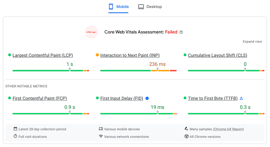
There are several ways you can improve your website’s page loading speed. A great place to start is Google’s Core Web Vitals which provide a set of metrics for scoring page experience. From how long your page takes to load, to what layout shifts occur, you can learn a lot about your website’s speed issues here.
My number one page speed tip is to start compressing your images. This can be done by using a tool such as TinyPNG before you upload them, or by installing a plugin such as Smush which will do the hard work for you. You’d be amazed at how many website admins don’t bother. The best option (although it can be expensive) is to run a content delivery network (CDN) that serves all your images at the best optimisation possible.

Once your images are optimised, you might need to talk to a developer (it’s okay they’re mostly human) and ask how you can reduce the amount of http requests your site requires from your server. These requests are images, files, stylesheets, scripts and so on, that are required to view your page. The more requests, the more time it takes.
The same goes for your code; it’s often supplied in a very unoptimised way but can be minimised to save time and requests. The good news is that your friendly dev can help you cut this number down.
However, it’s really important to remember that, whilst page speed makes a big difference to user experience, the relevance and quality of your content is more important when it comes to SEO.
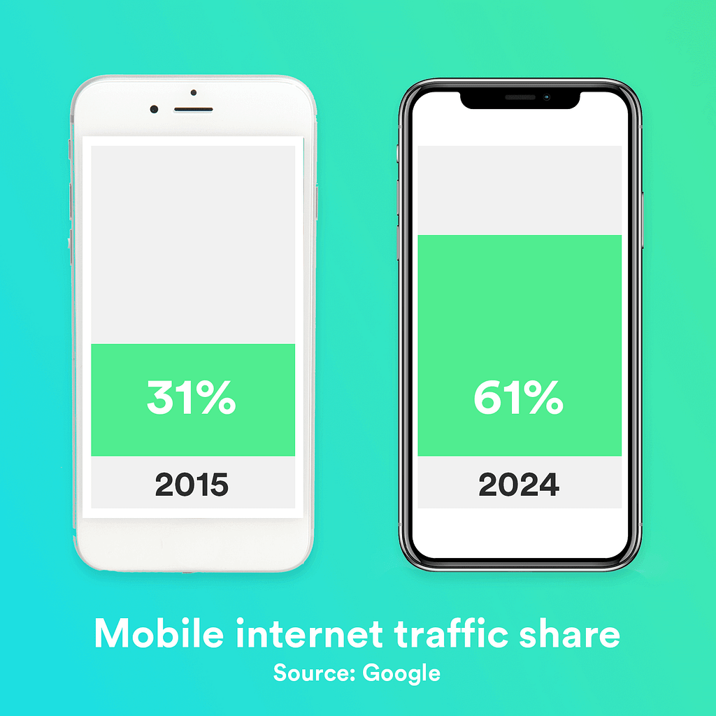
Surely not, in 2024?! Well, yes actually. According to a data study, 20% of websites still haven’t fully embraced mobile optimisation. That’s 1 in 5 sites that both look and function poorly on your phone. What’s more, the 80% that are mobile-friendly rank higher in Google too.
So what can you do? Well, there’s a principle called “Mobile-First Design” and it’s exactly what it says on the tin: when you’re designing your new website, consider mobile users first. This is something Google has been talking about for nearly ten years now so it’s remarkable how many web designers start with a desktop design first (probably because they, and their clients, are working from a laptop).
Google also advises site admins not to serve different information on mobile, compared to desktop, so it’s a good idea to start designing on the more constrained space anyway!
Going mobile-first also ties into the first point we made about speed; after all, nobody wants to use up their data on large images and loading a bloated site. Keep this in mind when you build your website, or add content to your existing one.
Confusing or cluttered navigation can frustrate users, leading to a bad user experience and an increase in drop-off rate. Whilst it’s never a designer, or website admin’s intention to confuse users there are plenty of ways this might occur.
Firstly, consider the content of your site navigation. Does it have too many or too few options? Are your key pages represented? Are you overwhelming your users? Or has the design become so minimalist that you’re neglecting function for form?
In the pursuit of shiny objects, some websites neglect tried-and-tested navigation functionality for new, fancy user interfaces (UI). This rarely works. By now, most core web design principles are well-established, and until a reason for a new UI comes along, your users’ muscle memory or instinct are similarly well-established. Keep things simple and intuitive, don’t reinvent the wheel.
Logic and intuition are your friends when it comes to navigation. Direct users, remind them where they are and how they can move forward (and backwards) to their goal.
When your website copy doesn’t read very well, you’re in trouble. Whether it’s poor grammar, spelling or an overload of jargon – if your message isn’t clear then your users will leave.
Because we’re talking about design here, I’m not going to labour that point… I’ll leave that to the copywriters. But even the best-written copy in the world will fall flat if you’ve not considered your site’s typography.
Your font choice, or typeface to be more accurate, is incredibly important. Deciding on an easy-to-read typeface for your main paragraph is the obvious starting point, keep it simple and you can’t go wrong. Heading typefaces often compliment your branding, but if your logo is cursive, or a little flashy you’ll probably need to reign it in a little and choose something more legible. Remember, people are here to gather information.
Let’s take the Disney website as an example; the home of magic could sprinkle its trademarked script logo everywhere, but it doesn’t – instead relying on a legible and straightforward typeface for the job.

But we’re not just talking fonts here. Your typography decisions cover far more than that. Probably best to whip out some bullet points here:
Funnily enough, a lot of businesses don’t pay enough attention to colour on their websites. They might think it’s a bit arty-farty to talk about colour psychology, or the influence of colour on a user’s experience but they’re just as influenced by colour as anyone else.
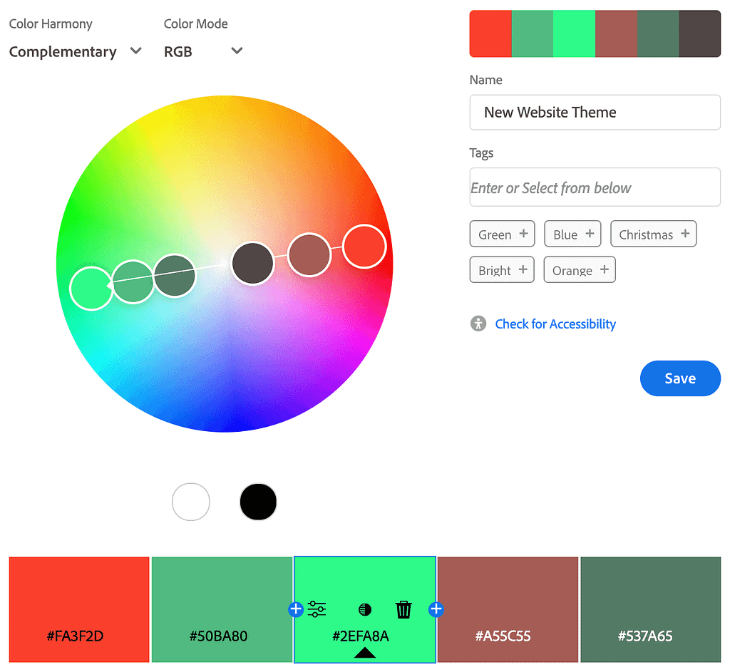
Designers are often told to “make it pop” but the effectiveness of that approach is often muddied by a client’s desire to make everything “pop”. Knowing how, where and which colours to use is more science than art. A thoughtfully chosen colour scheme can reinforce your branding and guide users to their goals, and, if you’re not a designer, there are lots of sites out there that can help. One example is Adobe Colour which has colour generators, accessibility tools and plenty of professional colour libraries to help you work out your brand’s palette.
However, it’s essential to strike a balance between creativity and usability when incorporating colour into your website. One common mistake is overloading the website with too many colours, or those that are at odds with the brand, resulting in a chaotic and overwhelming visual experience for users.
Another mistake is poor contrast between text and background colours, which can hinder readability and accessibility, especially for users with visual impairments. With a careful selection process and the strategic application of colour, web designers can create visually appealing and cohesive designs that enhance user engagement and overall website effectiveness.
While there’s no magical solution to instantly transform a website, addressing common design mistakes can significantly enhance its performance and user experience. Each of the five pitfalls outlined here presents an opportunity for improvement, grounded in logic, common sense, and expert guidance.
Need help with your web design or digital marketing?
Talk to an expert today or call us on 01332 493766
 Part of The Digital Maze Group