Posted 23.08.2024
By Pete Bingham
We all understand the importance of choosing the right words when it comes to SEO and UX – getting your message across in a way that both engages your audience and boosts your visibility with the right keywords. But did you know that the typeface you choose in your website design also plays a huge role in how easy your message is to read and how it’s perceived?
With so many typefaces available, both free and paid, it’s easy to feel overwhelmed (and tempted) by all those lovely, flashy fonts that might not suit your brand or website. So, how do you navigate so many options to find the fonts that best fit your needs? And why is choosing the right one so crucial?
Typography isn’t merely about selecting fonts; it’s about shaping how information is communicated to and perceived by visitors. Choosing the right typeface requires a deep understanding of your audience, knowing what’s appropriate, what will resonate with them and whether it will work with your branding.
In short, the role of typography in web design is crucial. The right typeface helps amplify your content, enhances readability, and reinforces your brand identity. Good typographic practice will help to structure your web pages and provide a hierarchy of information, from headings and subheadings to body copy – guiding users through the content and emphasising key messages.
In web design, typography serves multiple purposes:
Communication: A good typeface helps convey information effectively. How your brand does this with typography can be very different to how another brand might. Consider how a fashion brand might make very different choices to a financial advisor – both want to communicate with their core audience, but will achieve that in different ways.
Navigation: Good typography helps users find and navigate content through the use of headings, CTAs and legible, easy-to-read paragraphs. Without an intuitive structure to your layout, your website becomes very difficult to navigate.
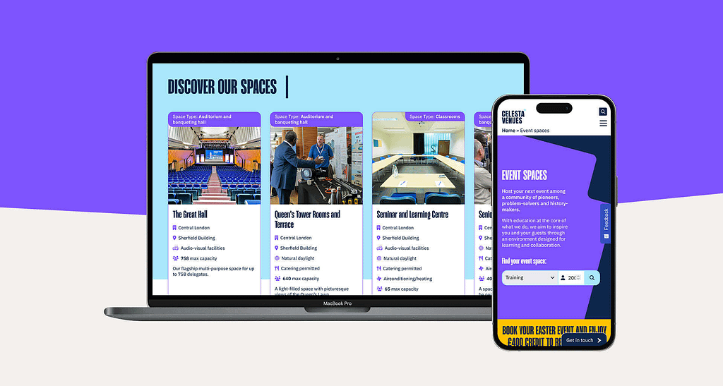
Brand: Typography has the power to evoke emotions in your users, enhance the overall visual experience of your site and work in harmony with your brand identity. Again, different brands will make different font choices – choose fonts that resonate with your audience and support your branding.
Responsiveness: People will consume your content on various devices – whether on mobile, tablet or desktop, your font choices need to sparkle across them all.
When you’re choosing typefaces, you need to make an informed decision by considering how your information best communicates with your audience.
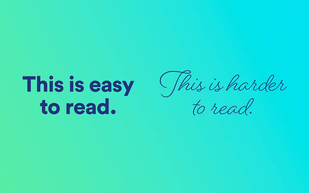
This question can probably be best answered with an example. Try and read the following:

Whilst the above typeface might work at a larger scale, or in short bursts, such as in a logo or headings, it’s going to be tricky to try and read a paragraph or more of it. In short, when choosing a typeface for your website, it’s important to consider how it will be used, not just how nice it looks.
Font size: Most written paragraph copy on a website is somewhere between 14px-18px in size. Meaning when you choose a font, you have to be able to read it legibly at that size.
Scannability: For the most part, your website visitors will scan read your copy, hunting for information. This means an easy-to-read font is a must, as well as using regular typographical devices to help break up the information – headings, bullet points, subheadings, italics, good line spacing and so on…
Accessibility: Web accessibility is vital for ensuring all visitors can use your website. Whether it’s selecting fonts with adequate contrast, well-sized counters (the open spaces in letters like o’s, a’s, e’s, etc.), or those designed to be dyslexia-friendly, there are many factors that can improve the readability, and therefore the accessibility, of your font choices.
Structure: The way you style your different heading sizes (h1, h2, h3), as well as your CTAs, hyperlinks and more, will determine your page layout and how you provide your information to visitors. It will also help define the correct spacing between lines, headings and paragraphs – all of which make reading more enjoyable.

Choosing the right typography for your website requires a good understanding of your brand and audience. You may already have brand fonts, hopefully selected by a professional designer, but if not, here are a few pointers.
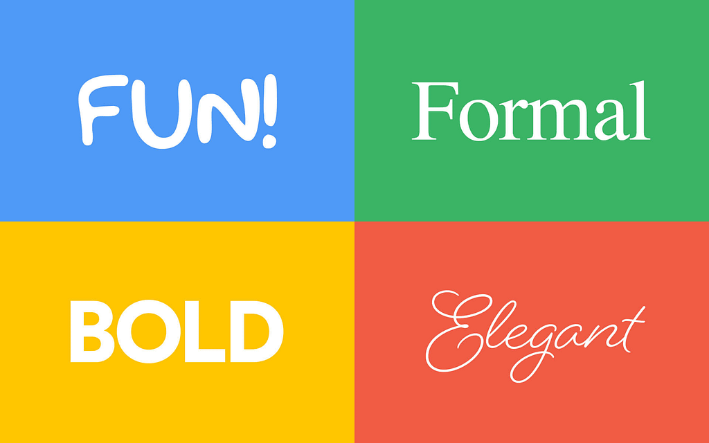
Tone: When it comes to heading fonts, or “display fonts”, the typeface you choose should reflect your brand’s personality, and resonate with your audience. For example, a toy shop website will choose friendly, fun fonts that work well with lots of colour, whereas a legal website will choose something that inspires trust and authority above all else.
Whatever you choose, make sure it matches the tone you’re trying to get across; whether it’s professional, or fun, loud or calming – there’s a font for every brand.
Readability: Unlike heading fonts, your body text font needs to be legible and easy to read, no matter your business. Choosing between sans serif fonts and serif fonts is often a personal choice, but your selection should prioritise legibility over style here. Keep it simple.
Consistency: Most websites will have at most 2 or 3 typefaces, though each may have a few font weights (e.g. light, bold, black) to emphasise points within paragraphs and headings. Any more than this can lead to a disjointed and cluttered appearance, confusing visitors and diluting your brand’s visual identity.
Knowing how to pair fonts is both an art and a science, and one that takes web designers many years to master in some cases. However, Google’s font knowledgebase can help you understand the basics and is a great starting point.
Font Websites: There are hundreds of font websites out there offering fonts for download, ranging from free options to paid ones. Again, it is easy to get overwhelmed with choices, and a designer can help you here. A few of our favourites include:
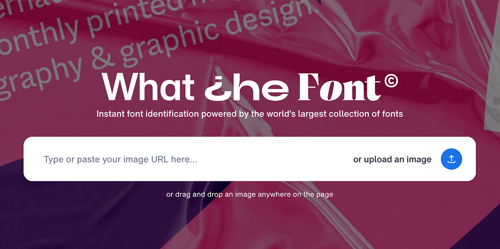
If your logo is set in stone, a great place to start is to upload it to a font recognition site. Our favourite is “What the Font?” by MyFonts. This tool will help to determine your logo’s font, or find similar fonts which can give you a few options that would work well for headings and larger calls-to-action. If your font is more script-based or complex, you might struggle to find a similar font that would work well in this instance.If all else fails, timeless sans-serif typefaces with plenty of font weights will rarely let you down.
Web Safe Fonts: When choosing typography for your website, it’s important to consider web safe fonts. These are fonts that are universally installed across most devices and operating systems – examples include Arial, Times New Roman and Verdana. Therefore whatever device users access your site on, they’ll be able to view the type as intended.
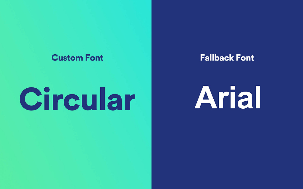
That said, in a world where you’re spoilt for choice in fonts, choosing something safe, plain and boring isn’t always the right choice style-wise, but you should still employ them as a fallback option in your CSS if your custom fonts fail to load.
With that in mind, your fallback web safe font choices should, within reason, resemble your custom ones – i.e. if your brand font is sans-serif, go with Arial.
User Testing: A great way to determine whether your font choices are good is to test them. Supply some example copy, complete with headings and paragraph copy and ask users to review the fonts. You should also conduct information recall tasks to gauge readability, accessibility, and ease of navigation. Give it a spin and see what works.
Best practice suggests a font size between 16px and 18px is ideal, but it can depend on the particular font, as each will be slightly different in terms of height and width.
Typography significantly impacts user experience as it can determine how the information you provide on your site is perceived and interacted with.
Clear and well-chosen fonts with a good hierarchy will enhance readability, improve accessibility, and make content easier to digest and understand, guiding users through the site and highlighting key messages.
The typeface you choose also helps communicate your brand’s personality, shaping users’ perceptions of your website. Overall, effective typography plays a crucial role in creating a visually appealing, user-friendly experience that fosters engagement and customer satisfaction.
When choosing typefaces for a website, it’s crucial to align them with the brand identity and personality to convey the right message. At the same time, it’s important to prioritise readability by selecting fonts with clear letterforms.
Try to limit the number of typefaces to two (e.g. one for headings and another for paragraphs. Using more can often lead to unnecessary clutter and confusion on your site.
In addition, avoid over-using font-weights and styles, such as bold and italics unless they are strictly necessary for emphasis.
Typography isn’t merely a design choice; it’s a powerful tool that shapes how users perceive and interact with your website. From establishing brand identity and guiding readability to enhancing user experience and accessibility – every decision about type influences how effectively your message is communicated.
By carefully selecting and implementing website typography that aligns with your brand’s personality, supports content and visual hierarchy, and prioritises user readability, you not only enhance visual appeal but also foster a more engaging online experience.
At Frogspark, we bring extensive experience in web design to the table. We ensure every typography choice enhances both user experience and brand identity. Our expertise ensures your website not only looks great but also speaks to your audience. Get in touch with us for a free consultation.
Further reading:
Creating Engaging Landing Pages
Need help with your web design or digital marketing?
Talk to an expert today or call us on 01332 493766
Part of The Digital Maze Group